
My Colours
- Danny McShane

- Nov 9, 2024
- 5 min read
Updated: Dec 26, 2024

This is a post about the colours I use in most of my paintings. I find my relationship with colour paradoxical as I was initally attracted to tonalist works and tried to think and paint like a tonalist but my friends always remark on how colourfully I paint. I’ve stopped trying to analyse this and have just relaxed into doing what I do. The idea of a limited palette appeals to something in me, but when I’m painting that part of me doesn’t get a say. I don’t understand it either.

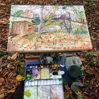
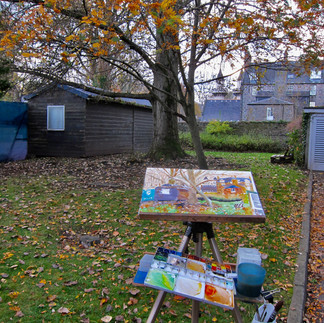
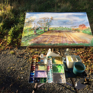
My most used plein air palette has around 20 colours (I just counted 24!) . That might seem a lot, but bear with me. It includes some convenience colours I could mix from the other colours I carry – but convenience saves time outside. And though I have those 20+ with me, a typical painting will probably see about 10 used, and of those some will be just tiny highlights or details with most of the painting using just five or six. Having the wide range available lets me tackle any subject -landscape, seascape or street scene, as I don’t always know what I’m going to paint when I head out. It includes a few colours I carry as half pans as I need very little of them or they tend to be powerful colours that a wet brush can pick up enough of from a pan as opposed to the fresh wet tube paint I normally prefer.

This has in it. 5 Blues: Phthalo Blue Green shade, French Ultramarine, Cobalt Blue, Cerulean Blue and Payne's Grey

6 Reds: Burnt Umber, Burnt Sierra, Permanent Rose Madder, Light Red, Cadmium Red and Alizarin Crimson


7 Yellows: Raw Umber, Raw Sienna, Yellow Ochre, Cadmium Yellow, New Gamboge, Cadmium Lemon, and Quinacrodone Gold,

3 Greens: Perylene Green, Permanent Sap Green, Viridian.

4 Secondaries: Transparent Orange, Cobalt Violet, Dioxazine Violet, Cobalt Turquoise Light. (and strictly speaking the greens are secondary colour of course).

Of these my most used colours, the ones I’m refilling constantly, are French Ultramarine, Burnt Sienna and Raw Sienna which in themselves are a blue, a red and a yellow so constitute a ‘primary set’. I use these singly and in almost every colour I mix. I sometimes wonder how I would get on if I only carried these -a future project maybe?
My least used colours, that might get a single highlight’s use in a painting are the opaque brights: Cobalt Turquoise, Cobalt Red, and Cadmium Lemon. (another blue-red-yellow triad). Generally I prefer to use transparent pigments, but these are useful as I usually apply them late in a painting and over other paint due to the nature of the detail I’m adding, like car brake lights, field flowers, clothing details and so on.
The greens get quite a bit of use in landscapes, usually as the basis for mixtures and having the three ‘starting points’ speeds a lot of mixed foliage. Perylene Green (sometimes called Perylene Black) gets a lot of use for shadows in foliage and mimics dark forest colours beautifully. I’ll add yellow or blue or even red to these starting colours to make varied foliage or to match a specific green I’m seeing.
Reds are my weakest suit, other than the earthy red colours that I use a great deal for buildings. And mostly I use them to neutralise greens or make chromatic darks. Or very weakly to warm up sky and building colours. This came as a surprise to me -I didn’t know I “wasn’t a red person”.
Blues I use a lot of. Painting landscapes with skies or seascapes uses a lot, as does mixing or adjusting greens and making the whole range of greys and most darks. Boats and vehicles tend to turn up blue in my paintings too. Having darker and lighter blues is handy for painting light and shadow by changing pigment rather than relying on dilution.
Yellows I must use a lot of, as my colour ink cartridges in my home printer run out of yellow before any other colour when I print copies of my paintings (not for sale, but when solving painting puzzles and considering options for studio paintings). Raw Sienna and Yellow Ochre I’ll use almost interchangeably depending on the degree of opacity I want. The true yellows and lemons I use very little other than as mixers. Quinacridone Gold I find quite a magical versatile pigment -even unmixed it delivers a wide range of colour (hue) as it dilutes, and its physical property of displacing other wet pigments is remarkable.
I often choose which pigments to use for colour mixes by whether I want a granulating or non-granulating result. So for example a smooth dark might be Viridian Green and Alizarin Crimson while a granulating dark might be French Ultramarine and Burnt Umber. The resulting colour can be similar but the paint behaviour and resulting texture quite different.
I tend to vary the mixes I use to make any stretches of flat colour more interesting to look at and I also sneak odd pigments in for fun, so a broad patch of grey on a building might have six or seven colours in it by pairs as I vary the pigment mixes while trying to keep the tone the same. One of the big attractions of watercolour for me is the way mixed paint can settle and separate out in the texture of the paper if you apply it at the right consistency and let it dry undisturbed. I find this very attractive and quite a ‘hands off’ experience. Over time you get to know which combinations give good results and can use them to generate textures and the illusion of detail without brushstrokes.
So that’s a quick run through the what and why of my current palette. I’ve no qualms about using a special colour as a one off, or using a gouache for a highlight if needed. I haven’t discussed brands, though they make a difference due to often using different pigments for the same ‘named colour’ and also using different binder mediums that affect the paint consistency and behaviour. But that would be a subject for another post.
I suspect the bottom line is if you paint enough your colours will find you, depending on what and how you paint. You might not even realise they have until you find you're not looking for any more, and maybe even thinking you might do without one or two.


Happy painting


Hi Danny, you made some points on the way through that just hadn't occurred to me, like choosing a particular paint for reasons other than colour. Do you know if this sort of thing applies to hard paints from pans in the same way? This is something I'm going to have to look into in more detail as I really like the results you get! 👍 Graham
It's always interesting to read about artist's choices and see the effect in the style of their paintings! I appreciate the mixture of thought and experience that has gone into your palette, Danny. Are there any colours you think you might add or do without in future? And if you were starting out in watercolour, would you pick particular colours or the same ones?
PS Thanks for such a helpful Blog 😁
Thanks for this Danny. I found it refreshing after reading so many articles telling me I should limit my palette to achieve better harmony in my paintings. The thing is I like how lively your paintings look and the notion of harmony didn't cross my mind when looking at them. I wonder if your wide palette choice is a big help to such joyful paintings?
PS. I see a Cotman tube in your first photo- do you use student paints as well as prefessional ones?